Here is a quick photo prompt starter for you:
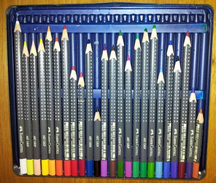
What does this picture make you think of?

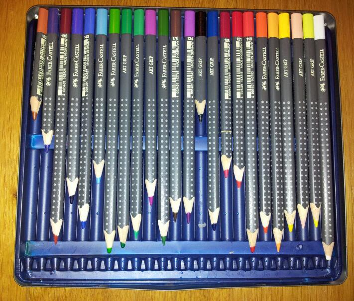
If you said favourite colour bar-chart or line graph, you’d be wrong.
The shorter the bar, the more popular the colour.
However turn it upside down and here is your line graph:
The heights of the blue bars are the amount of each colour used – hence more popular.

