*HEALTH WARNING*
You may require nerves of steel to complete this dramatic construction of a distance-time graph. A mental swear box may also be handy for everytime you resist the urge to say what you are thinking. Strong coffee is not advisable as you want to be the image of serenity, not a jittery wreck.
Ready? We shall begin …
Aim
To construct distance-time graphs from collected data and interpret the speed from a graph.
Equipment
Metre sticks or tape measure
Open area outside
Pencils
Paper (squared/graph etc)
Ruler
Calculator
Stopwatch (or mobile phone app)
Chalk (optional)
Spreadsheet (optional)
Activity – in theory
- Group your students in threes. They will rotate roles between runner, timer and recorder.
- Pick four points in your school yard that are a reasonable distance apart. Chalk X’s and A to D next to them. Your graph will start at A and end at D. If you have the space you can create more than just four points.
- Students are responsible for measuring the distance between A & B, B & C and C & D. These are the three activity stations.
- Students take it in turns in their groups to run (walk, hop, dance etc) between two points. The time for each student at each station is recorded.
- Once the data is collected, students gather the information in a table – cumulative time & distance columns will be helpful for plotting a distance time graph.
- Each student draws three graphs, on the same axes, to represent the speeds of their group.
- Each student then calculates their speed for each station. They can compare their calculations with their group and what is going on in the graph. Hopefully they will deduce that the gradient of the graph represents the speed.
Activity – in practice
Where to start?
Please … don’t be disheartened if your activity starts like mine did! We got organised and went outside. I designated groups to stations and they started measuring, moving onto the next station when they were done.
One group came up to me and complained that the distances were all the same. Rather than hold onto the end of the tape measure at the start, then measure, this group put the end on the ground, spooled out the tape measure and walked to the next station – trailing the end of the tape along the floor.
A second group complained that the other groups were spending too long on measuring when they were waiting for a tape measure. I’d counted them out one per group – where was it?
‘Oh, we left that in the classroom’.
Mental gnashing of teeth.
‘Would that be the locked classroom?’ I ask
‘Yeah … we’ll get it’ off run two students
They come back complaining the classroom is locked!
Okay … we get the measuring done. Then they start running and timing. I check on one group and notice they are merrily taking all of their times away from ten minutes. They explain the mobile phone is counting down from ten minutes. Although I was impressed by their ingenuity, maybe changing the phone mode would have been more appropriate.
And let’s not mention the student who, on the final station, accidentally wiped all the results off the mini-whiteboard …
Then a miracle happened!
I collected their data together on a spreadsheet and projected it on the board. We discussed any anomalies and how we would progress. We decided neat printouts would help. They drew their graphs, colour coded their data and observed the gradient link to speed. I was very impressed by the speed at which they grasped this concept and proud of their (eventual) independent work.
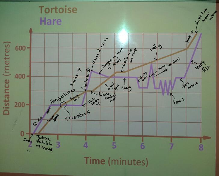
Here is a sample of their work:
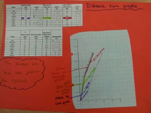
Example 2:
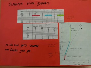
Example 3: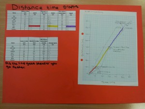
Like this:
Like Loading...
 Image Credit: trustedreviews