Tag Archives: Average

247. The Elf Challenge

It was the month before Christmas and all through the house not a creature was stirring – except for the senior elves who were on the brink of all out war. Father Christmas had picked up some leadership strategies on his travels and decided to send his management elves on a team building day … paintballing!

Don’t be fooled – this is no simple Christmas time-filler. This task requires problem solving strategies, two-way tables, averages, data analysis and logic. In fact, you might want to have a go yourself. There is a task sheet, support sheet and solution.

The Elf Challenge (pdf)

Enjoy the puzzled faces and watch the arguments when students try to justify their answers.

243. Messy Means

I have recently been teaching lower ability Year 9 students how to calculate the mean from grouped and ungrouped data tables. I didn’t want to teach them a method to learn by rote, so I used a more investigative approach.

mr-messy-mykea

Image Credit: http://www.thisismykea.com/designs/mr-messy

Grouped Frequency tables discussion

Estimated messy mean A (pdf)

I started with a table with all the working shown, but some information blacked out. Each group had an A3 version and they filled in what was missing.

Estimated messy mean B (pdf)

The second table had more information covered up. After a discussion the groups decided there wasn’t enough information and they would have to guess what the missing numbers were.

Estimated messy mean C (pdf)

The third table had minimal information. Each group used their own method to find the missing values. Some chose the largest value in the range, some guessed what the results could have been in each group and one group decided to calculate two means – one using the largest value and one using the smallest.

We collected our results together on the board and discussed their accuracy. The class decided to use the middle of each range to calculate the estimated mean. They had gone from no understanding of estimated mean to formulating their own method.

We followed this up a Splitting the Steps estimated mean worksheet that I wrote after seeing Bruno Reddy’s presentation after #MathsConf2014 (Mr Reddy’s blog).

Follow him on Twitter: @MrReddyMaths


229. Speed Camera Maths

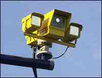
Speed Cameras are so last century: discerning law enforcement agencies favour the Average Speed Camera!
image

These motorway delights timestamp when you go through certain checkpoints and calculate your speed between them. No complicated laser guns required, just number plate recognition and a little distance/time calculation. This already sounds like a KS3/4 class activity or a Mechanics A-Level starter.

Equipment
Squared paper
Pencil
Ruler
Coloured pens
Calculator (optional)

Question
Can you find three different (safe) strategies for staying on the right side of the law through extended roadworks? You must average 40mph over 12 miles (original speed limit 60mph).

Visual Prompt
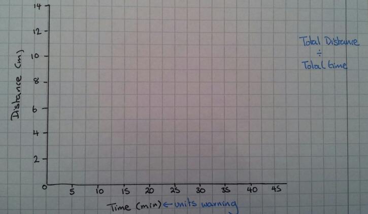
To start off with just draw out blank axes and discuss how you could visually represent this problem.

Idea 1
A distance-time graph
image

Idea 2
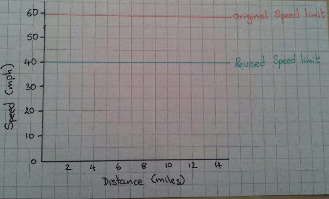
A speed-distance graph

image

Idea 3
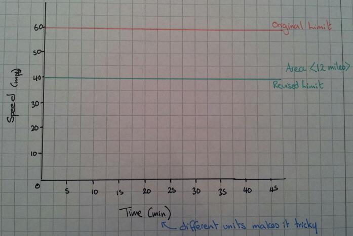
A speed-time graph

image

The straightforward option
How long should it take you to get through the roadworks if you stick to exactly 40mph? What does this look like on a graph? Which type of graph shows this information best?

Top Gear Alert
The boy racer wants to go fast, but avoid a ticket – what could he do?

Hint
What does ‘Average Speed’ actually mean?
Can you instantly jump between speeds?
Is acceleration going to effect your calculations?
What assumptions should you make about acceleration?
Do you need to work out the area under the graph or the gradient at all? How will you do this?
Can you describe what is going on?
Is it safe/legal?

Outcome
Your students should be able to produce many different graphs of how to stay on the right side of an average speed zone. They should be able discuss their findings with each other. However the morality or safety of their driving ideas may be a topic of discussion for a later PSE lesson …

221. The ‘Average’ wage

Here’s a problem on averages that has been used by many teachers over the years. I like the additional ‘sting in the tail’ as it really makes pupils think about real life and it is an instant use of calculating the mean from an ungrouped frequency table.

hiring

Image Credit: www.vivcorecruitment.co.uk

The Problem
A job advert says that the average worker at OfficesRUs earns over £30 thousand pounds.

OfficesRUs Salaries:

  • Director   £100,000
  • Manager   £50,000
  • Sales Person   £35,000
  • Clerical Assistant   £22,000
  • Trainees   £15,000

Is the advert true?

The Discussion

If pupils calculate the mean they will find it is £44,400 – this makes the advert true

But why would a company have the same number of employees at each pay grade?

The Sting

OfficesRUs is a clerical agency, offering temporary clerical staff for other businesses. Their staff numbers are:

  • 1 Director   £100,000
  • 4 Managers   £50,000
  • 8 Sales People   £35,000
  • 200 Clerical Assistants   £22,000
  • 4 Trainees   £15,000

Is the advert still true?

The Result

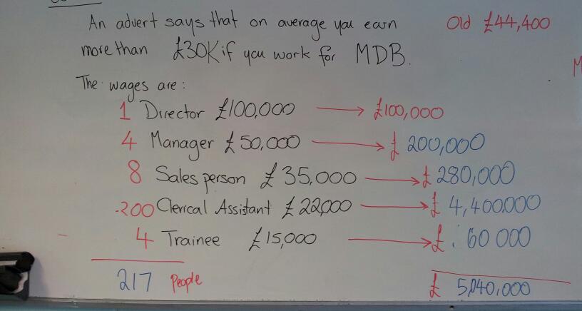
My class worked out how much each pay grade would get and added them to find the total salary cost. Some pupils then divided by 5, but discovered that the mean would be far greater than the Director’s salary. They then realised they had to total up the employees too. The mean turned out to be less than £30,000. This then leads to a discussion of which measure of average is best in this situation.

This is the working out from my board. The original problem is in black, with the sting and working in red. We linked the individual pay grade calculations to the work we had done on means from ungrouped frequency tables. The layout of the calculations is very similar to our tables.

image

This  was a really good investigative starter to bridge between a theory and problem solving lesson. You could get pupils to see if they can find any examples of job adverts with average salaries in and make up their own problems.


113. Did the Little Thinkers get you thinking?

Did my Little Thinkers give you ideas for a lesson?

I hope so!

These are my little crisp people and they’ve been helping pupils learn for over a decade.

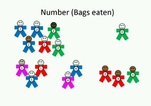
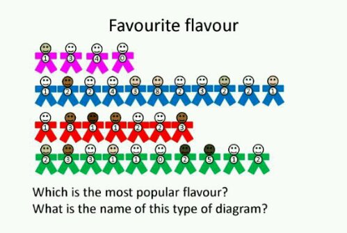
I first thought up this task when an interactive whiteboard and digital projector came in the form of an overhead projector. Using the brand new concept of colour printing onto inkjet OHP transparencies, we could move these little people around the board and investigate different problems. Each number represents the number of bags of crisps eaten in a week. Each colour represents a flavour (Blue = salt & vinegar, red = ready salted, green = cheese & onion, pink = prawn cocktail).

You can sort by number of bags eaten:

image

You can create a flavour pictogram:

image

In fact you can use this resource with KS2 & KS3 to investigate lots of topics:
Sorting by category (number/colour)
Ordering numbers
Pictograms
Venn diagrams
Carroll diagrams
Bar-charts
Averages
Questionning
Probability

And anything else you can think of.

I’ve created an editable template of figures, in three different sizes. You print them out and use them individually, in group work or on the wall. There is also a teacher guide on how to use the crisp people.

Enjoy!

Download your little people below:

Editable template  crisp-people-template-blank

Teacher guide and presentation crisp_people_guide

3. Class Averages

This is my favourite activity for introducing different measures of average. You can do this in a corridor or outside, no special equipment required.

Set Up
Line up the class in height order

Range
Ask the shortest and tallest students to stand back to back. The difference in height is the range.

Median
Tell the first and last student to make a half turn. Ask the second and second to last student to make a half turn. Repeat until only one or two students are facing forward.
One pupil = median height.
Two pupils = halfway between their heights is the median.

Mean
Imagine everyone is the same height. Tell the students to try to be the same height by bending knees or standing on tiptoes. Explain the mean is about sharing out equally.

Mode
Ask students to put themselves into groups of the same height. The biggest group is the mode.

This activity links a numerical calculation with a physical activity, which makes it more memorable.