Quartiles on cumulative frequency graphs are such easy questions when you get ‘it’. The hair pulling, nail biting wrong answers you see on exam papers make you wonder if you’ve ever taught the topic. Time for the scissors again …
Activity
This activity demonstrates in a practical and visual way how to set up the quartiles on a graph.
Equipment
Printed cf graphs
Rulers
Scissors
Glue
Coloured pens
Task
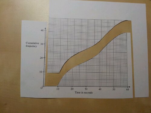
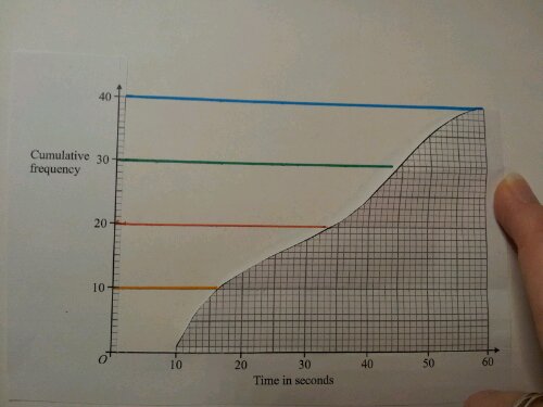
1. Cut out the area to the left of the graph. Leave a column of graph squares next to the y-axis, for scale. Cut exactly to the top of the curve.
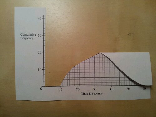
2. Fold the graph in half, parallel to the x-axis, with the maximum value just touching the axis.
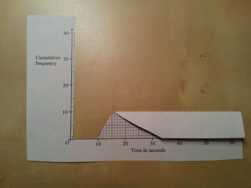
3. Fold along the x-axis. Unfold – you’ve just divided the graph into quarters. This should reinforce that y-axis is split into quarters.
4. Stick down the axes. Place a ruler on the fold lines and join the ends of the folds to the y-axis.
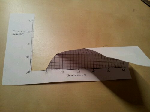
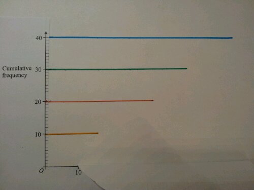
5. If you fold the graph forward you get this:
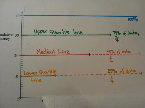
6. Put a mark at the end of each line and continue with a dotted line. Discuss what proportion of the data each line represents and label it.
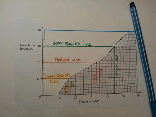
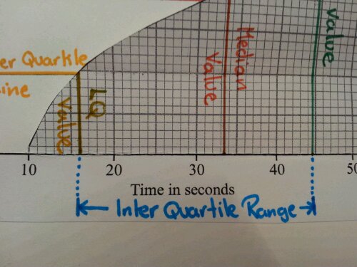
7. Fold the graph back and mark in the vertical lines. Solutions,can now be read from the x-axis.
8. The interquartile range can also be highlighted and calculated.
Review
This activity covers a fair few learning styles and creates a visual/memorable resource,in their books. Since using it, the number of pupils who quarter the x-axis has dropped significantly. I hope it works for you.

