Category Archives: Handling Data

187. Clever circles

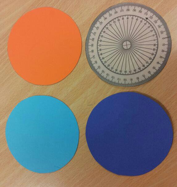
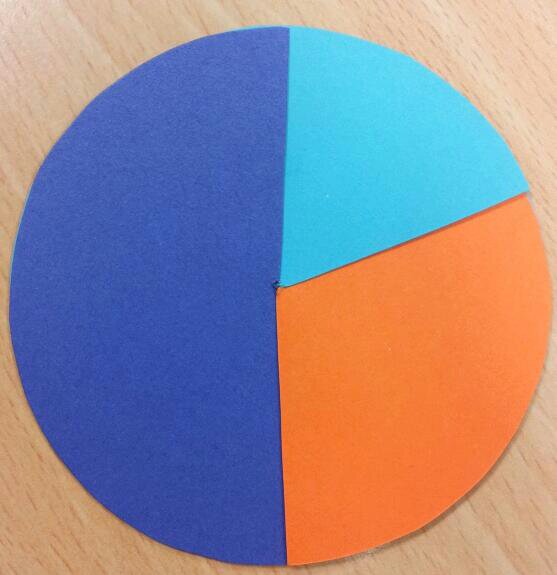
Here is a quick, multi-function resource for you: a set of overlapping circles for angles, pie-charts and fractions/percentages.

Equipment
Card
Scissors
Pencil
Straight edge or ruler
Pair of compasses
A 360 degree protractor printed on paper (or a tracing paper protractor cut out)

Construction
1. Cut out three identical circles and the paper protractor.

image

2. Stack them on top of each other and put the pointy end of the compasses (or a drawing pin) through the middle. Wiggle it around to make a bigger hole – please don’t stab yourself.

3. Draw a radius on the circles.

image

4. Cut down each radius on the circles and the 0 degree line on the protractor.
5. All done!

Activity 1: Angle Estimation
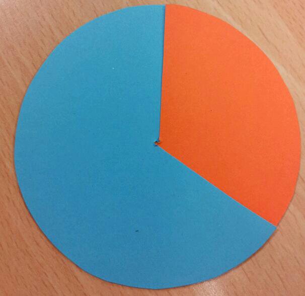
Slot two circles together:

image

Estimate the orange angle.
What could the blue angle be?
Show me an acute angle.
Show me a blue 170 degree angle.

Activity 2: Reading a protractor scale
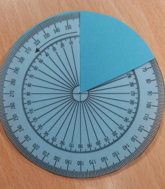
Slot the protractor into a circle:

image

How big is the blue angle?
Show me an 80 degree angle.

Activity 3: Pie-charts
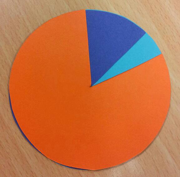
Slot the three circles together:

image

What could this pie-chart represent?
Show me a pie chart with two equal sections

Activity 4: Fractions and percentages
Use three circles again:

image

Estimate what percentage is purple.
What fraction could the blue section represent?

185. I’ve lost a Dime


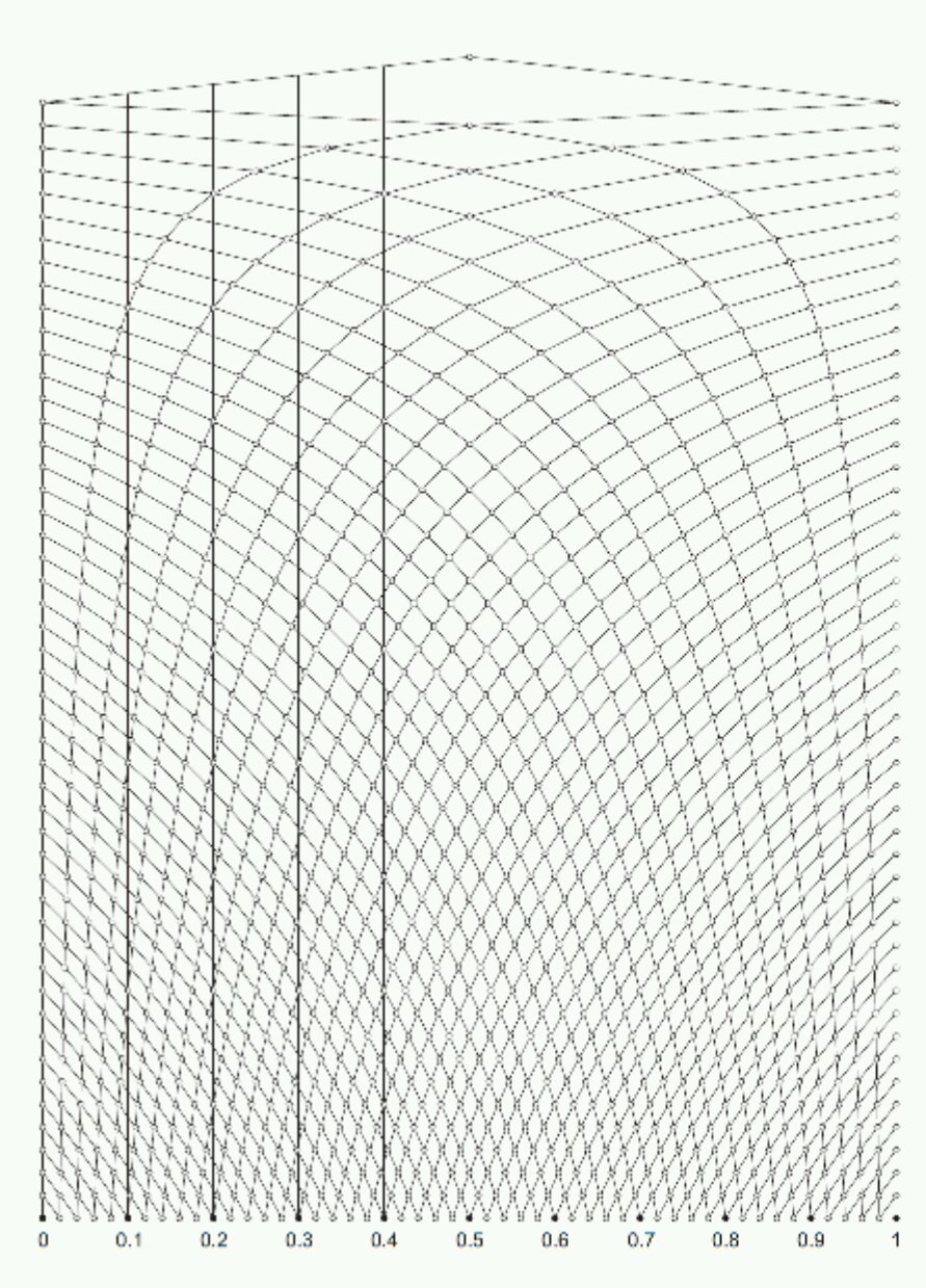
I haven’t actually lost a dime, rather I’m missing a Dime – specifically the second Dime probability pack. It was a great teaching resource for experimental probability from the first school I taught at. Unfortunately it is no longer available, although it is listed on the Tarquin archive site. Each student had a plastic tube with different coloured beads, a related experiment card and a record card. They could investigate the meanings of key vocabulary, carry out repeated trials and use this amazing graph paper, designed by Geoff Giles, to record results:

image

The graph paper works a little like a bagatelle or pinball machine. You start at the top ‘pin’. A success means move along the line to the next pin on the right, a fail means move to the left. You always move in a downwards direction. The more trials that are recorded, the further down you go. When you reach the bottom you will have carried out 50 trials and will be able to read off the experimental probability as a decimal. I found this blog (medianchoices of ict) with links to the Nrich website and interactive probability graphs. The graph paper from the Nrich site is here: RecordSheet.


Activity

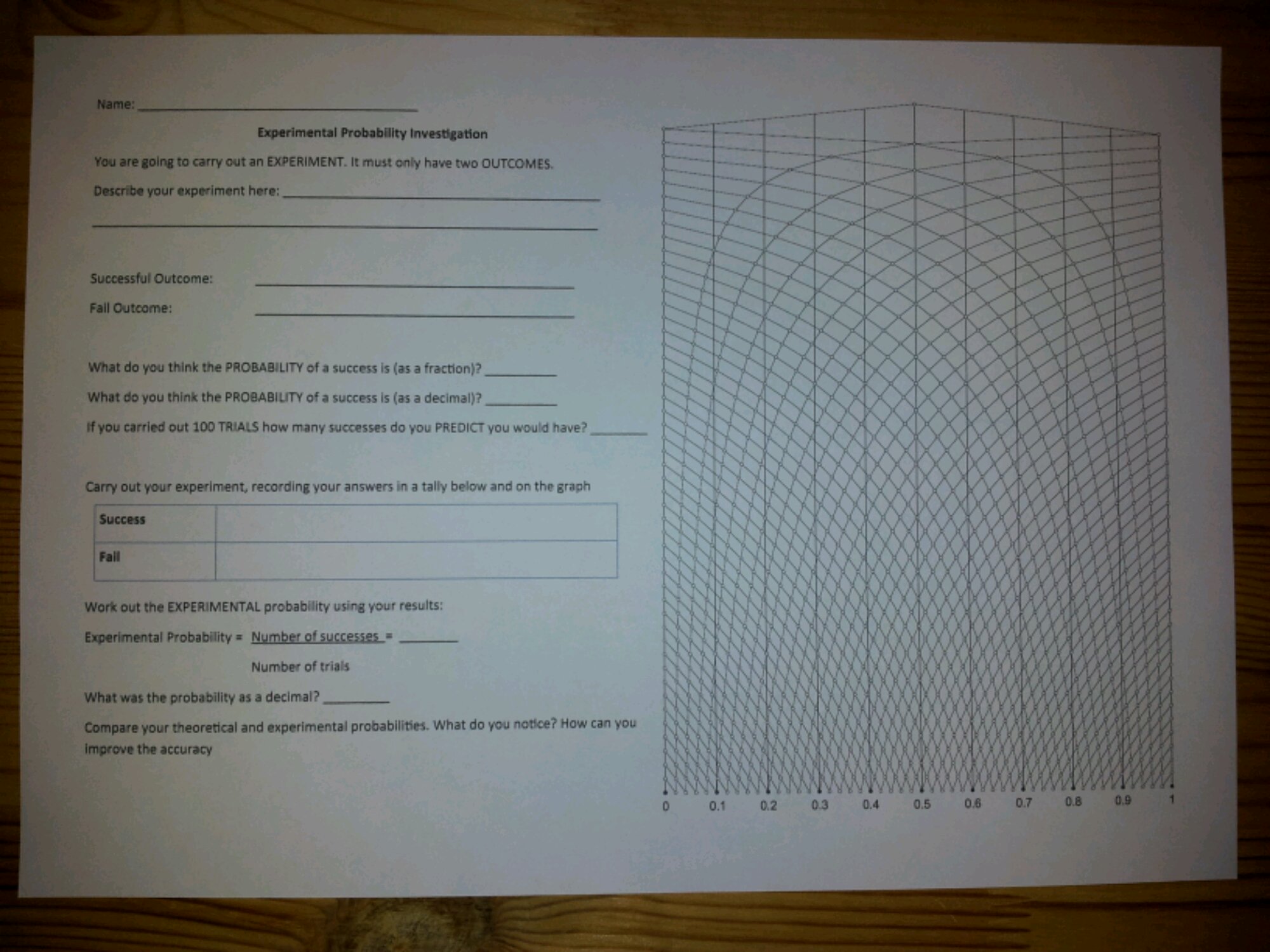
I decided to recreate the old Dime investigation sheets:
image

Students start by explaining what their experiment is and define what is a success/fail. They give the theoretical probability as a fraction and decimal, then predict the number of successes in 100 trials.


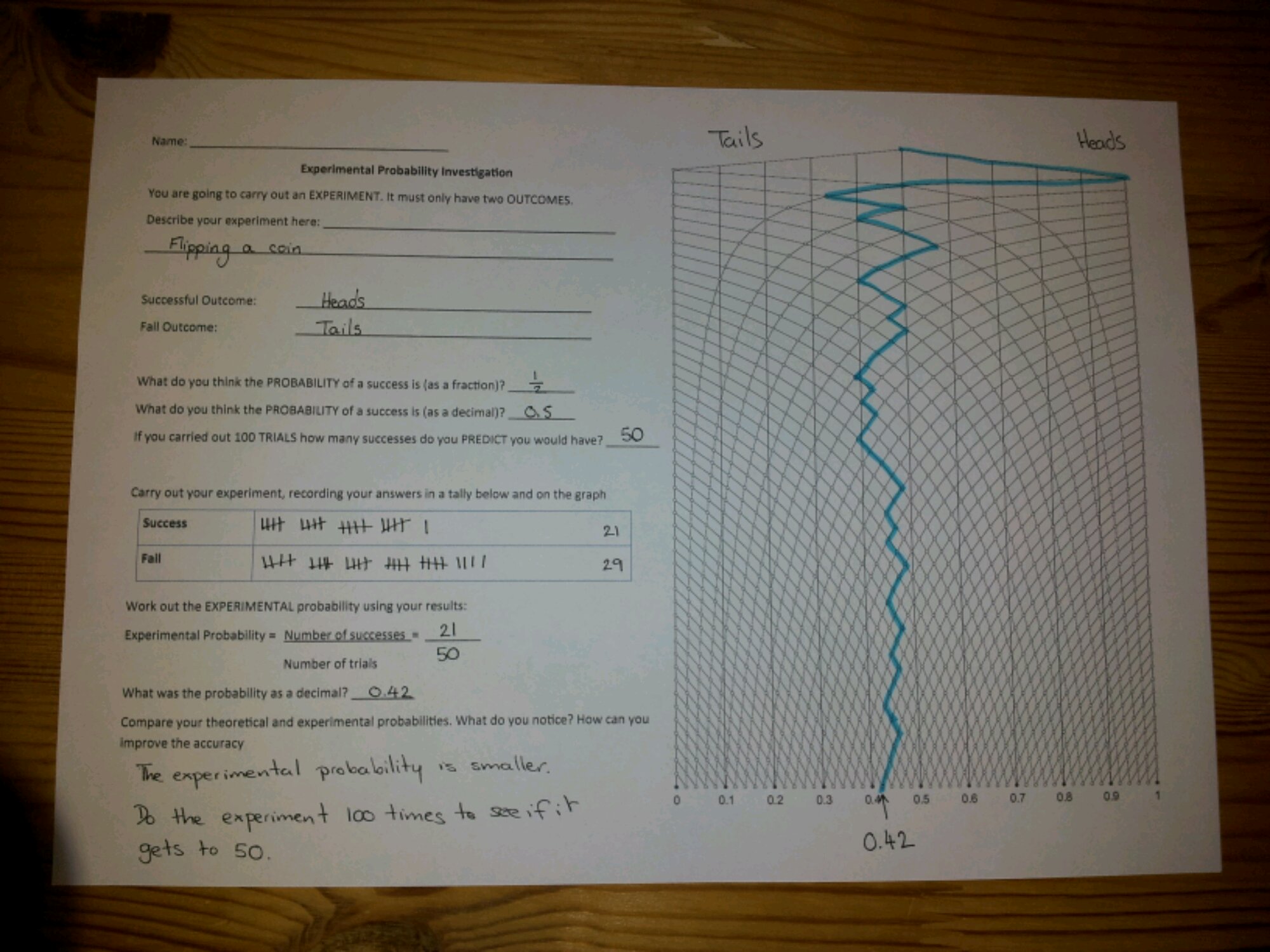
Students then carry out their experiment, recording their results in the tally chart and graph. After 50 trials, they write down the fractional experimental probability of success using the tally total and the decimal probability from the graph – hopefully they are the same! Students then reflect on their work and consider how to improve their results.

Download the worksheet here: Experimental Probability investigation

Sample

image

176. Christmas Craft

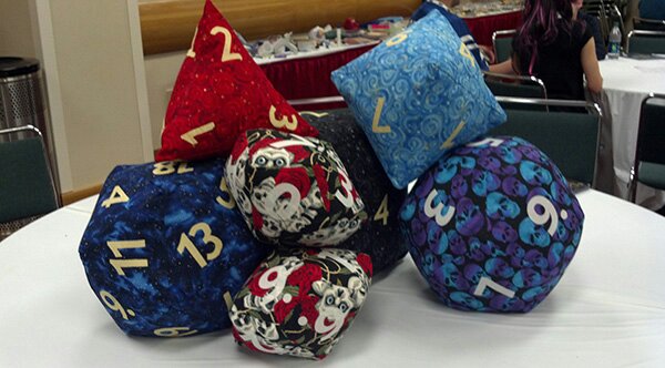
So, what to craft for that maths geek special someone … may we suggest polyhedral dice pillows?

image

These squashy beauties are from ¡The Anticraft!. There are full instructions and helpful diagrams on the website. These would also be a great classroom resource.

Warning: the folks at Anticraft are honest in their language, so don’t click if you prefer subtler prose.

160. TMNW 2 – Learning Wall 1

Earlier this term, my colleague, J, and myself attended the rather brilliant #TMNorthWest at Calderstones School. We were particularly inspired by the idea of independent or ‘Help yourself’ learning walls. We’ve chosen this as our Departmental focus for the year and once we have trialled it, we hope to install a learning wall in every maths room.

The basic premise is that ideas and key points are collected in themed pockets, which students can go to whenever they require assistance or a hint on how to progress. The cards are numbered and indexed. The idea was introduced by Claire Gillies in the context of English lessons.

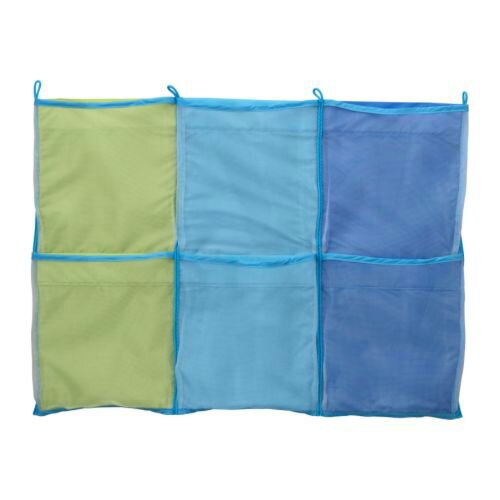
The self help cards were stored in hanging wallpockets:

image

Claire used the Kusiner wallpockets from Ikea.

There are six pockets in this particular product. We have chosen to split them into the following categories:
*Number
*Algebra
*Data
*Shape
*Using equipment
*Index

We designed our cards to have methods, misconceptions, Levels/Grades, a question with worked answer and possibly QR codes to useful videos.

Now, sitting and designing a self help card layout is easy. Completing them is a much bigger task! We have decided to start with KS3 and have selected key objectives from the Y7 scheme of work.

We also have GCSE classes who sat their exams last week and, quite frankly, need a break.

This sounds like fate …

The plan is that Year 11 students will take Y7 objectives and write self-help cards. Teachers will moderate/edit what they write.

Well, that’s our plan for a bit of independent student power. I’ll continue to post about our walls as they develop.

141. Book(s) of the week 3

If you remember ‘The Wonder Years’ you are probably old enough to remember grunge the first time around and television programmes that didn’t involve so called ‘Reality TV’.

image

So what happens to female child stars?

Some have a rocky youth, work really hard and become hugely successful (Drew Barrymore). Some have a rocky youth and become hugely notorious (Lindsay Lohan). Some work really hard, do research, writing and acting, have a theorem named after them and become advocates for women and maths education!

Step forward Danica McKellar!

image

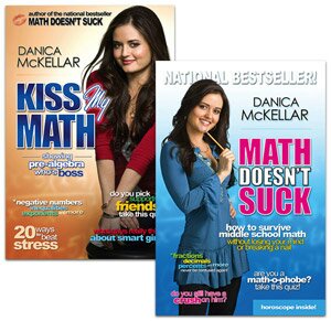
Apart from playing ‘Winnie Cooper’ in ‘The Wonder Years’, Danica is also a successful mathematician. She has written four books aimed at promoting maths to high school students, in particular girls. I strongly suggest you have a look at them or get your school library to purchase them as they are full of inspirational ideas and new ways to think about ‘dusty’ topics.

Her books to date are:

Girls Get Curves: Geometry Takes Shape (2013)

Hot X: Algebra Exposed! (2011)

image

Maths Doesn’t Suck: How to survive year 6 through year 9 maths without losing your mind or breaking a nail (2010)

Kiss my Math: Showing Pre-Algebra who’s boss (2009)

140. Cut out the Quartiles

Quartiles on cumulative frequency graphs are such easy questions when you get ‘it’. The hair pulling, nail biting wrong answers you see on exam papers make you wonder if you’ve ever taught the topic. Time for the scissors again …

Activity
This activity demonstrates in a practical and visual way how to set up the quartiles on a graph.

Equipment
Printed cf graphs
Rulers
Scissors
Glue
Coloured pens

Task
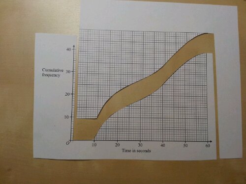
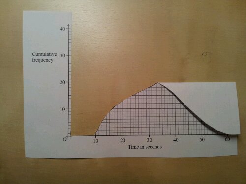
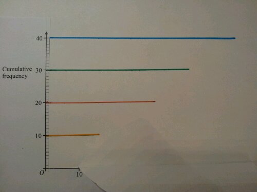
1. Cut out the area to the left of the graph. Leave a column of graph squares next to the y-axis, for scale. Cut exactly to the top of the curve.

image

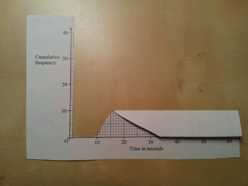
2. Fold the graph in half, parallel to the x-axis, with the maximum value just touching the axis.

image

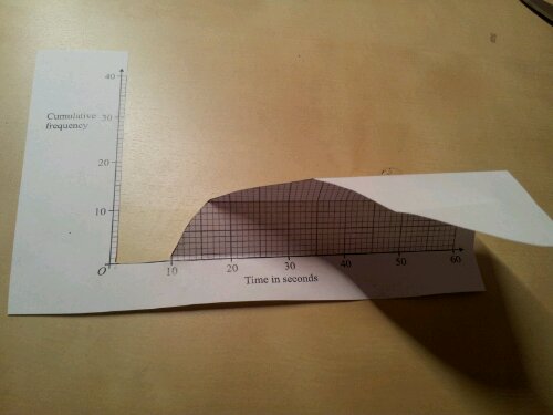
Repeat the half fold again
image

3. Fold along the x-axis. Unfold – you’ve just divided the graph into quarters. This should reinforce that y-axis is split into quarters.

image

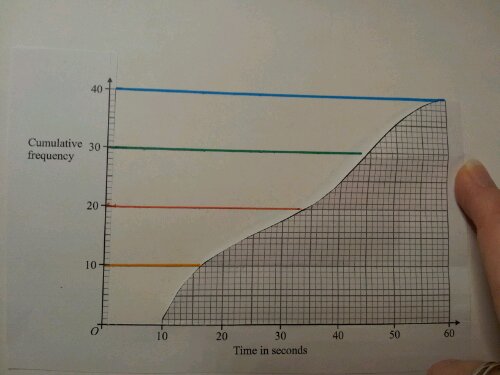
4. Stick down the axes. Place a ruler on the fold lines and join the ends of the folds to the y-axis.

image

5. If you fold the graph forward you get this:

image

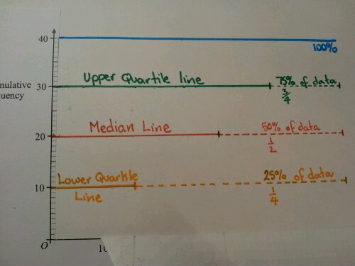
6. Put a mark at the end of each line and continue with a dotted line. Discuss what proportion of the data each line represents and label it.

image

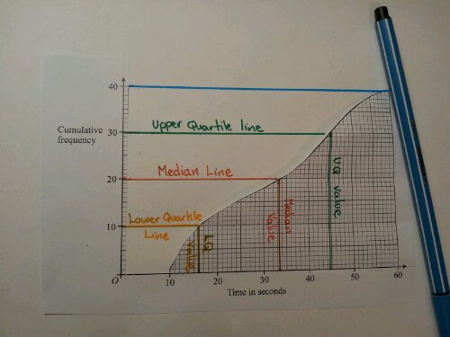
7. Fold the graph back and mark in the vertical lines. Solutions,can now be read from the x-axis.

image

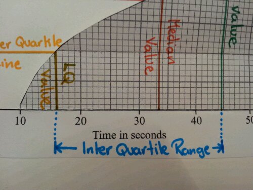
8. The interquartile range can also be highlighted and calculated.

image

Review
This activity covers a fair few learning styles and creates a visual/memorable resource,in their books. Since using it, the number of pupils who quarter the x-axis has dropped significantly. I hope it works for you.

132. Good question, Bad question 1

I like a topic that you can have fun with and also relates to the big bad world outside the classroom. We are constantly asked our opinions on websites, customer feedback surveys … even personality ‘tests’ in magazines. Every day there seems to be a new set of survey results hitting the news. How can you link a lesson with life?

Instead of telling pupils about biased questionning and surveys, why not give them a week or so to make a note of how often they are asked questions? They can evidence it by taking photographs, screengrabs, cutting surveys out or writing them down.

Task
Mix up the pupils into groups and get them to focus on what the question is asking and how they are expected to answer.

Note
Be prepared for some off topic discussion if they have surveys like ‘Which member of boyband X are you most likely to marry?’ or ‘Have you got what it takes to be the next (insert sportsperson or team manager here)?’

Development
Discuss which questions are fair (unbiased) and which are leading you to a certain opinion. If there are multiple choice answers, do they cover all possible ideas? Think about who would have access to this survey (sampling/sample size).

Challenge
Imagine you work for a website, magazine or shop.
1. Design a fair survey researching opinions on a relevant topic.
2. Design a very biased survey on the same topic.
3. Carry out the surveys on the same people.
4. Compare results.
5. What impact did the bias/unbiased style have?