Category Archives: Handling Data

221. The ‘Average’ wage

Here’s a problem on averages that has been used by many teachers over the years. I like the additional ‘sting in the tail’ as it really makes pupils think about real life and it is an instant use of calculating the mean from an ungrouped frequency table.

hiring

Image Credit: www.vivcorecruitment.co.uk

The Problem
A job advert says that the average worker at OfficesRUs earns over £30 thousand pounds.

OfficesRUs Salaries:

  • Director   £100,000
  • Manager   £50,000
  • Sales Person   £35,000
  • Clerical Assistant   £22,000
  • Trainees   £15,000

Is the advert true?

The Discussion

If pupils calculate the mean they will find it is £44,400 – this makes the advert true

But why would a company have the same number of employees at each pay grade?

The Sting

OfficesRUs is a clerical agency, offering temporary clerical staff for other businesses. Their staff numbers are:

  • 1 Director   £100,000
  • 4 Managers   £50,000
  • 8 Sales People   £35,000
  • 200 Clerical Assistants   £22,000
  • 4 Trainees   £15,000

Is the advert still true?

The Result

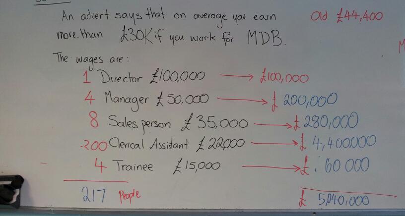
My class worked out how much each pay grade would get and added them to find the total salary cost. Some pupils then divided by 5, but discovered that the mean would be far greater than the Director’s salary. They then realised they had to total up the employees too. The mean turned out to be less than £30,000. This then leads to a discussion of which measure of average is best in this situation.

This is the working out from my board. The original problem is in black, with the sting and working in red. We linked the individual pay grade calculations to the work we had done on means from ungrouped frequency tables. The layout of the calculations is very similar to our tables.
image

This  was a really good investigative starter to bridge between a theory and problem solving lesson. You could get pupils to see if they can find any examples of job adverts with average salaries in and make up their own problems.

 

219. Good question, Bad question 1

It’s been a while since I’ve done a step by step instruction post, so I thought I would share this lesson on questions and surveys.

Objective

  • To understand bias in questions
  • To consider how to structure answer options.

Equipment

  • Exercise books or paper
  • Pens
  • Ruler/straight edge
  • Scissors
  • Glue

Step 1

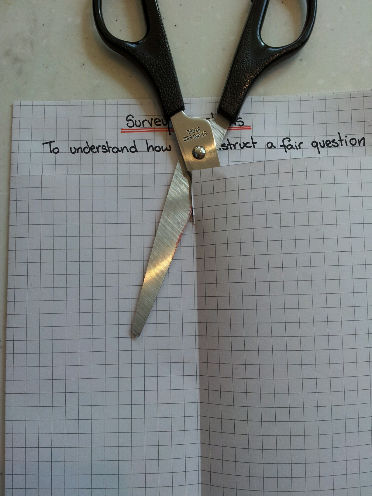
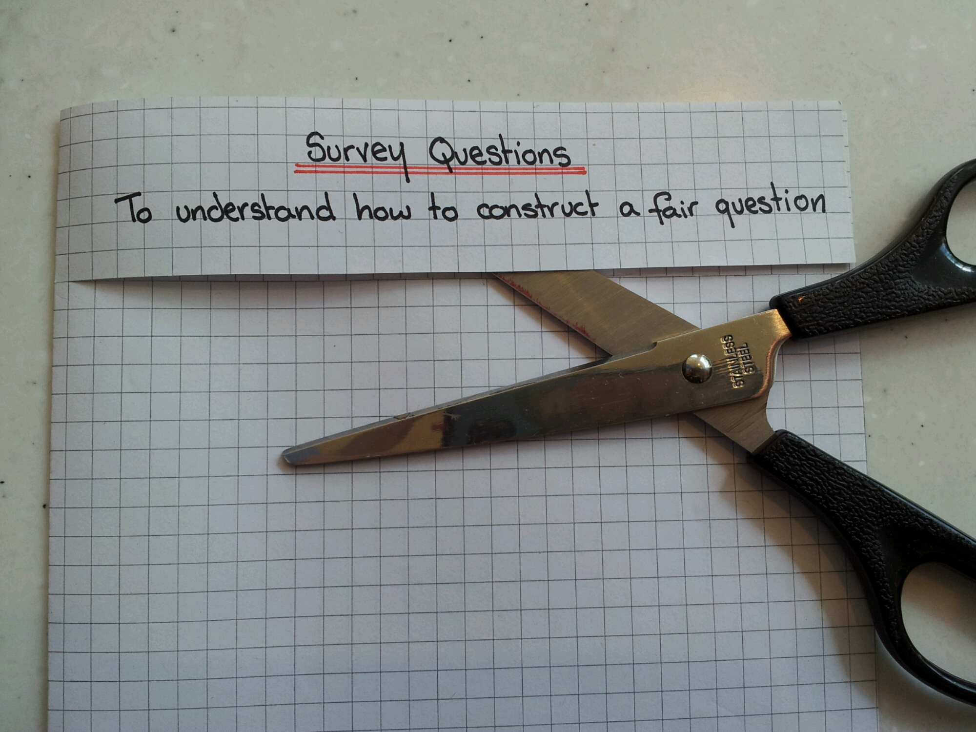
Write out your usual headings: title, date, objective etc. Cut across the page to the spine. Stick the title page to the lower page.
image

Step 2

Fold the lower half of the page in half and cut down the fold.
image

Step 3

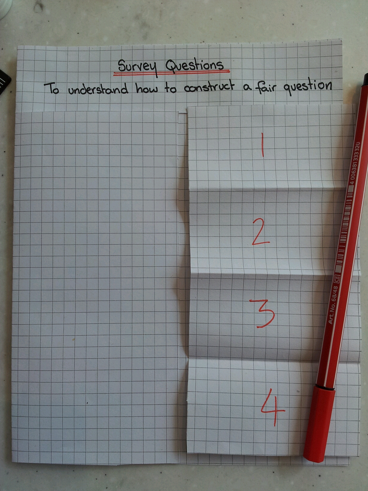
Fold the loose piece of paper into four equal pieces. Mark the fold positions in the book.

image

Step 4

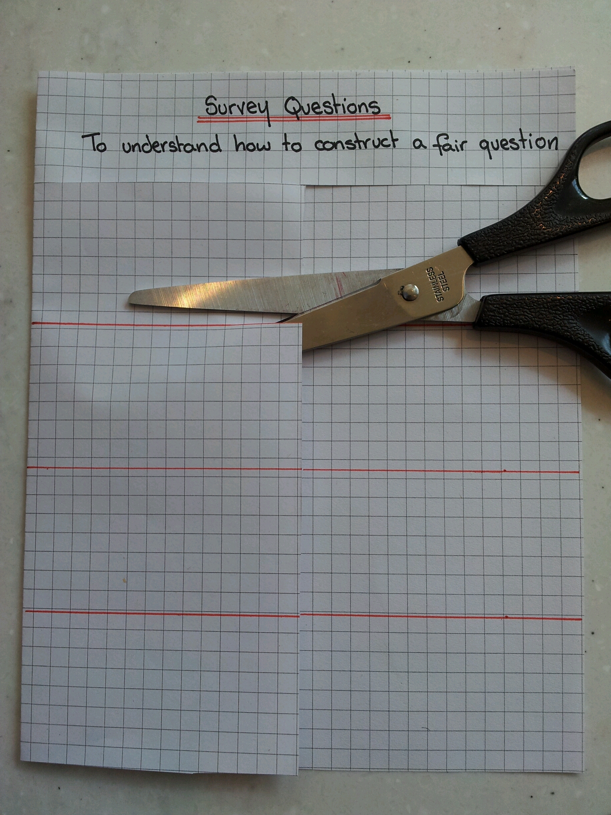
Draw horizontal lines across both the upper and lower pages. Cut the upper page to the spine along those lines to make four flaps.
image

Step 5

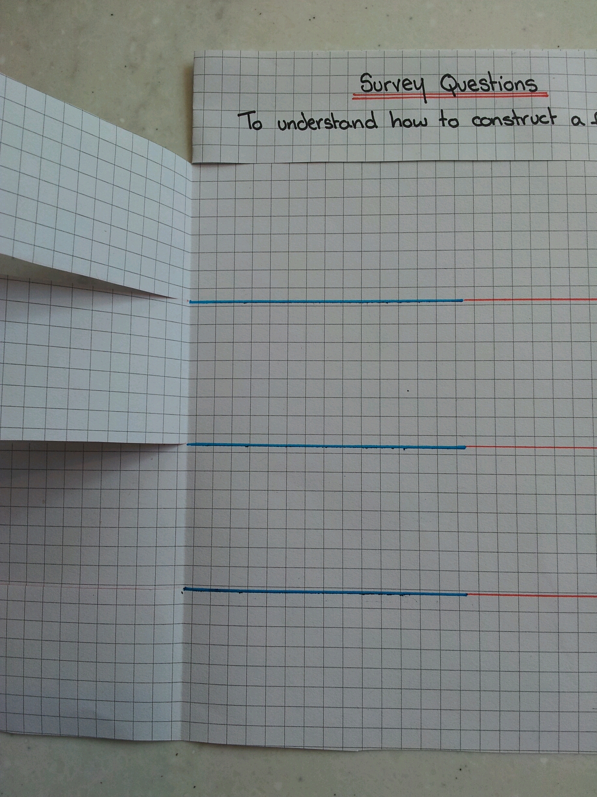
Continue the horizontal lines on the lower page under the flaps
image

Step 6

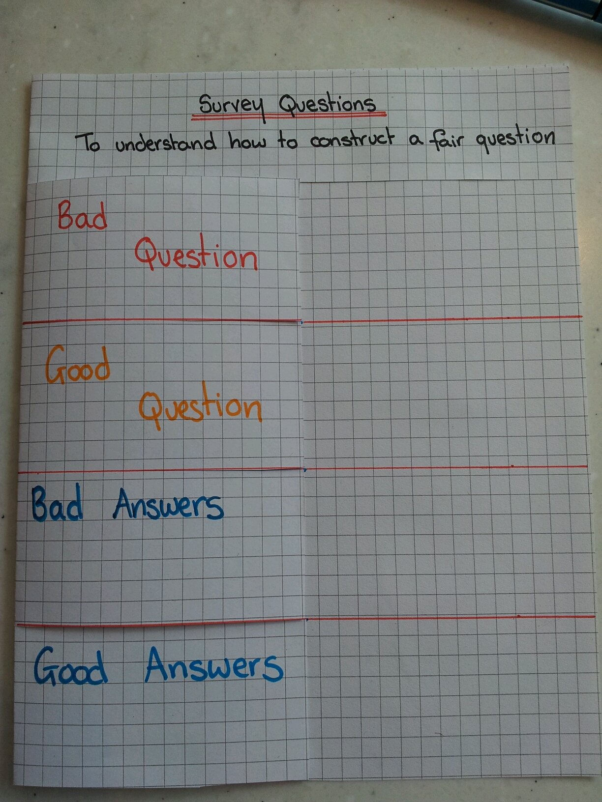
Label the flaps as shown
image

Step 7

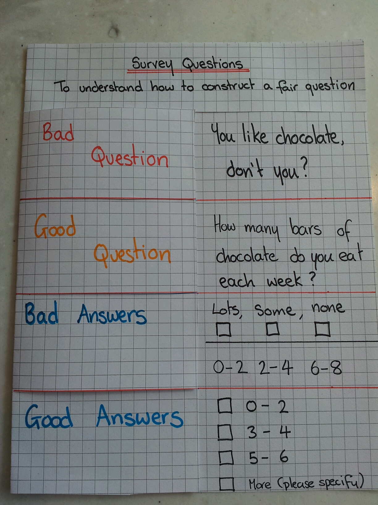
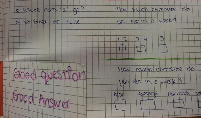
Give examples of bad questions, good questions, bad response boxes and good response boxes
image

Step 8

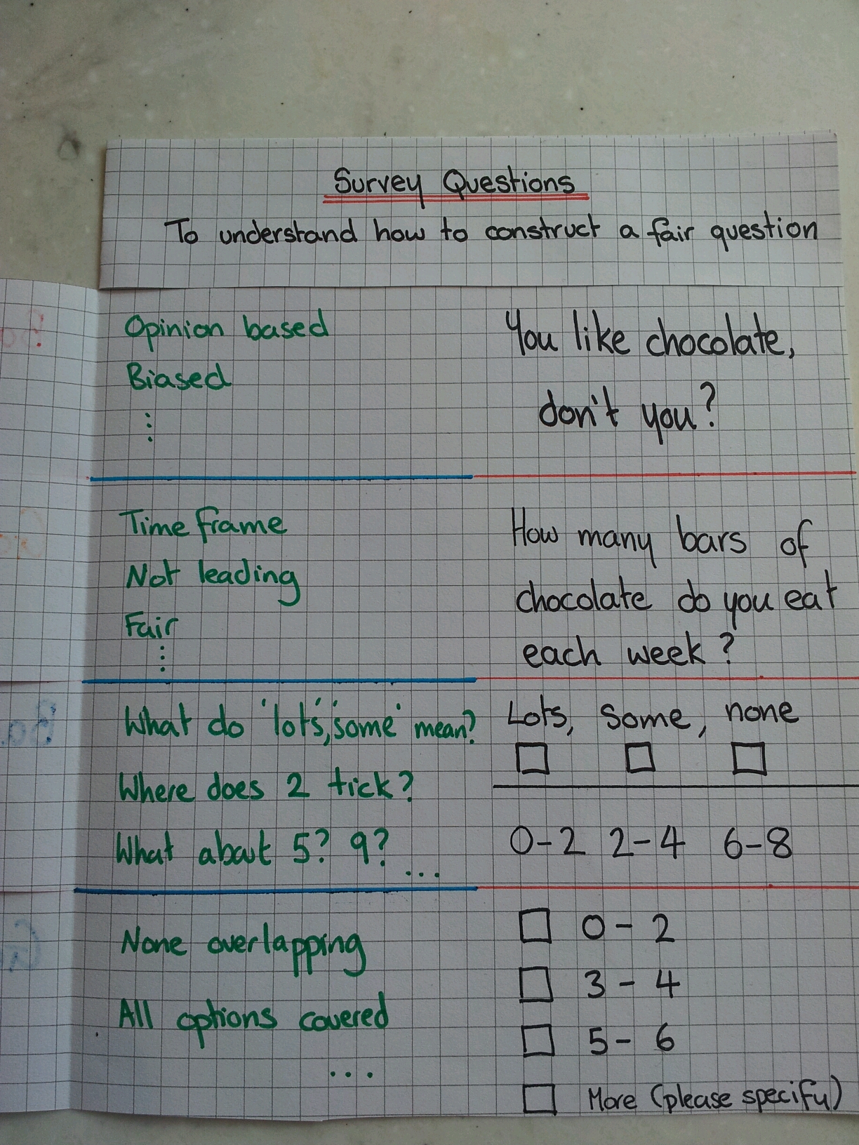
Under each flap justify why each question or response is good or bad.
image

Review

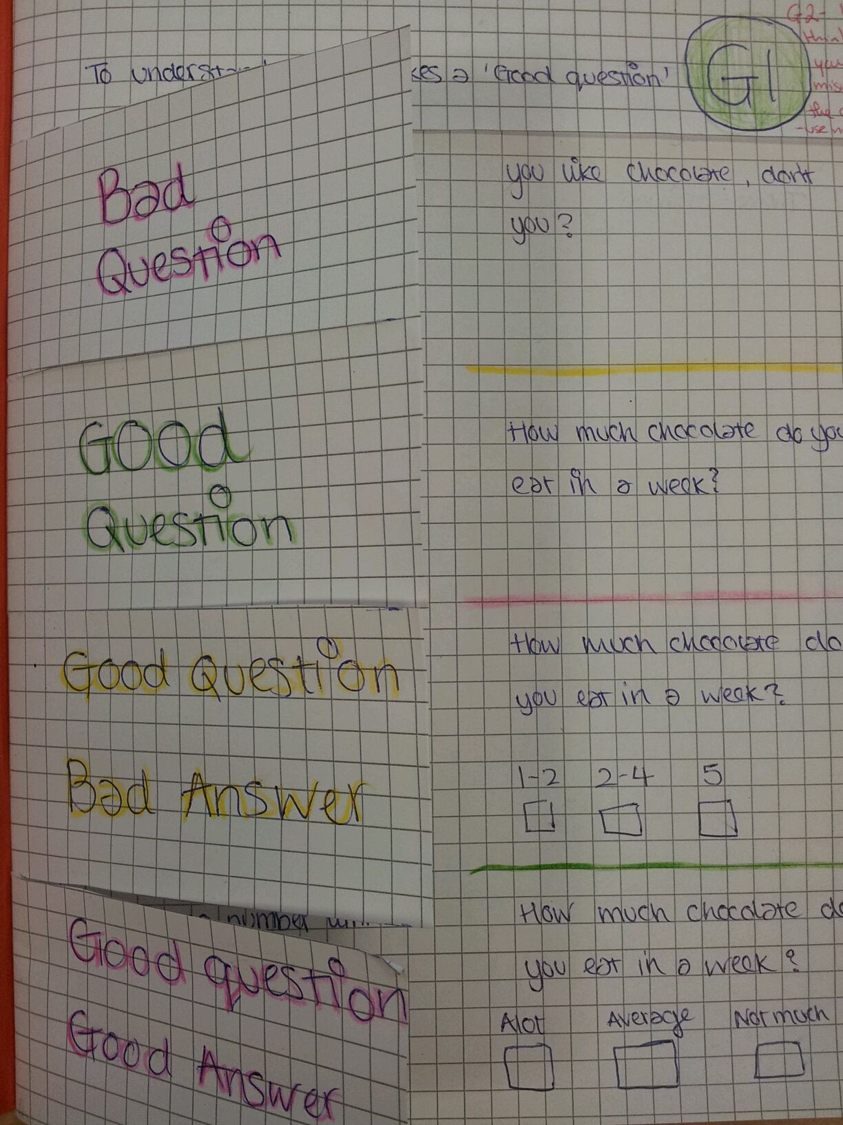
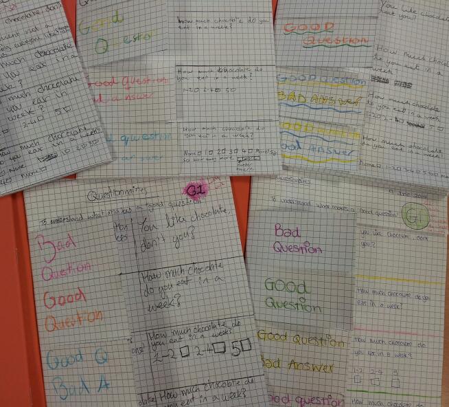
My class really enjoyed this activity – one of them even wrote it in their feedback. The following are examples from my class. You might even spot some RAG123 on their pages. Follow @ListerKev or search #rag123 on Twitter to find out more.
image

image

image

200. Website/Resource of the week 4

Wow! This is proper blog post number 200. How should I mark this occasion? Why, by recommending another splendid site of course!

To quote the folks themselves: JustMaths is born from the passion and spirit of three full time teachers at the “most improved school in England” (January 2013).

The site has both free and subscription resources. The latest initiative is the ‘Bread & Butter’ worksheets. It consists of straight-forward starter worksheets to practice essential skills for students: Just Maths: Bread & Butter. My class use them every lesson and I’ve noticed a real improvement in their confidence and quality of solutions in just two weeks.

197. £40.95

Today we have a discussion starter question for you, inspired by a trip to the shops.

image

My shopping cost £40.95 today. What is the smallest number of coins required to make this amount?
If I paid with two £20s and a £10 note, what is the most efficient change?
Why would someone pay £41.05, as opposed to £41?

I purchased 17 items, do you have enough information to calculate the mean?
The most expensive item was £10, the cheapest was 45p. What does this allow you to calculate?
Two luxury items cost £9 in total. If I hadn’t bought these, what would the mean have been? Does this effect the range?

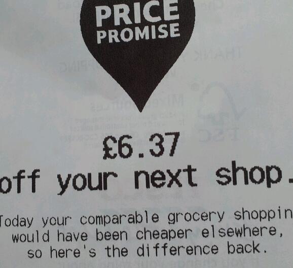
When I paid I was given this voucher:

image

What would the shopping have cost somewhere else?
What would the mean cost per item be after this discount?
What percentage discount is this?

You could also use this as a discussion starter about the number skills you use when you go shopping.

195. Marshmallow Maths

It’s our first birthday at the MathsSandpit and this post is party themed. Remember a few years ago, when chocolate fountains were the ‘in thing’ at celebrations and parties. The healthy guests stuck to strawberries drenched in chocolate. The unhealthy went for marshmallows on sticks and … well … all I’ll say is Geraldine Granger (Vicar of Dibley – Chocolate Fountain)

I’m trying to decompartmentalise the maths in my students heads. They struggle to see the links between different topics. So I introduced ‘Marshmalllow Maths’ – they were intrigued/hungry as soon as I mentioned it.

Equipment

  • Cocktail sticks
  • Pink and white marshmallows

Step 1

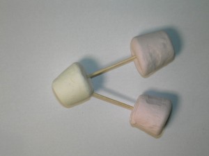
Image

Ask your class to connect the marshmallows together


Step 2

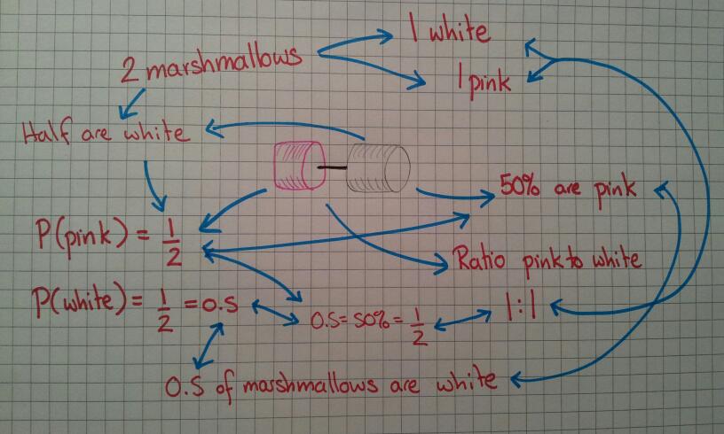
What mathematical characteristics do the marshmallows have? I’ve summarised my classes’ responses below:

image

Two marshmallows lead to ratio, percentages, fractions, decimals and probability. The links between these topics start to emerge.

Step 3

Add on another marshmallow

Image

How have the ratios, fractions, decimals, percentages changed?


Step 4

Make another 1:2 ratio marshmallow, identical to the previous one. How have the mathematical facts changed? In fact although the numbers have changed, the proportions have stayed the same which is proved when you simplify the numbers. Physically you can prove it by stacking the structures on top of each other – from above it looks like the original structure.

At this point I went cross-curricular and discussed the similarities between the marshmallow structure and water (H20). I was going to label the marshmallows with H and O, but my food-colouring pen wasn’t working. My logic was that water always has hydrogen and oxygen in the same ratio – this means we know we can drink it. If the ratio suddenly changed to H2O2, we would be in trouble! As far as I can remember H2O2 is hydrogen peroxide and is better for bleaching than drinking. This actually got the idea across quite well – no-one tried to fudge their ratios.


Step 5

I then allowed the class to make their own simple structures using their own piles of marshmallows. They had to make at least three identical structures, work out the related maths and prove that their numbers could be simplified to the basic form. In doing so they also looked at converting ratios to fractions and also found fractions of amounts.


Step 6

Eat marshmallows (whilst doing some related questions).


Optional: Step 7

Calculate the percentage increase in body mass on results day! It was marshmallows today, a chocolate prize for cracking a code earlier in the week and they say they learn better when they eat. I think it’s all a ploy to scrounge more food … but if it works … maybe fruit next time!

192. It’s a stick up!

Just a quick picture to share today. My colleague, D, went to the same TeachMeet as me and was equally impressed by the use of gaffer tape in the ‘Big Maths’ presentation.

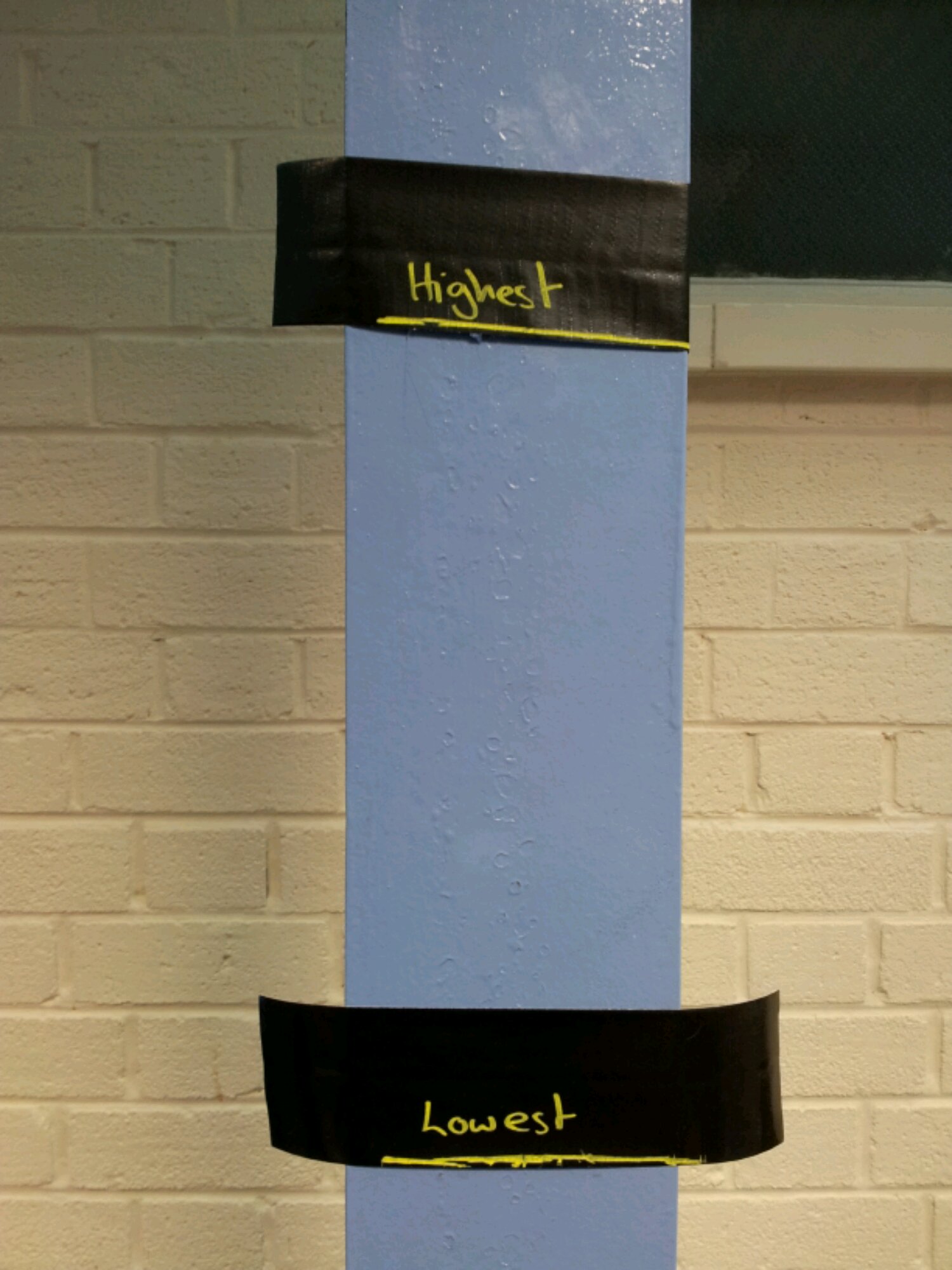
Today his class were doing box plots and took the idea of averages even further. They made a vertical box-plot on a wall of the class heights. Brilliant!

image

I’m sure this idea has lots of potential.

188. Ducks, chalk and gravity

So how did TeachMeet result in me standing in a supermarket one evening doing a price comparison of duct tape?

Let us go back in time to #mathsmeetnorthwest. Dave Usher did a brilliant presentation on ‘Big Maths’, including the use of gaffer (duct) tape in lessons. I thought this was a genius idea – sticky, sturdy and temporary. I didn’t get a chance to buy any at the weekend, so I ended up in the supermarket on a weeknight.

But what to buy?

Cheap own brand duct tape at £2.95 for 15m or branded ‘Duck’ tape at £3.95 for 25m?

I started school the next day with one idea on how to use it, which quickly developed into three..

Lesson 1: Averages

Equipment: Duct tape, liquid chalk marker

I did averages and range indoors. This meant I couldn’t chalk the walls or floor. However I could mark out key features with tape. I used the activity Averages and marked out the median, the highest and lowest values on the floor. It was at this point I figured out I could write on black duct tape with liquid chalk marker – brilliant! We labelled the wall with the highest and lowest heights of the class so we could see the actual range of heights.

image


Lesson 2: GCSE Revision

Equipment: Exam papers, scissors, glue, wall paper, duct tape

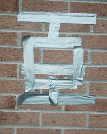
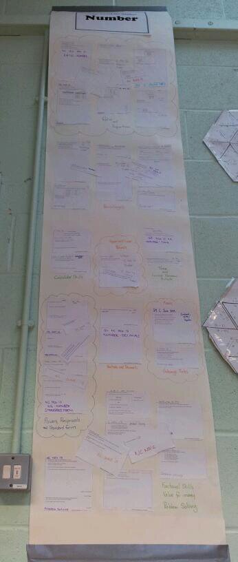
I have been using the Foundation GCSE Review with my Higher GCSE resit group. Reviewing ten Higher GCSE papers involves over 200 questions – that’s a big wall display! Both of the TeachMeets I have attended have used the idea of learning wallpaper. So that’s what we used – I’m grateful that some of my students are over 6ft tall or the wall display wouldn’t have gone up.

image

Now the duct tape was used to secure the top of the wall display and to ‘passer-by’ proof the bottom. It should last longer now that the lower end is reinforced.

image


Lesson 3: A-Level Mechanics

Equipment: Duct tape, liquid chalk, mobile phones, calculators, soft ball (I used a ball of wool)

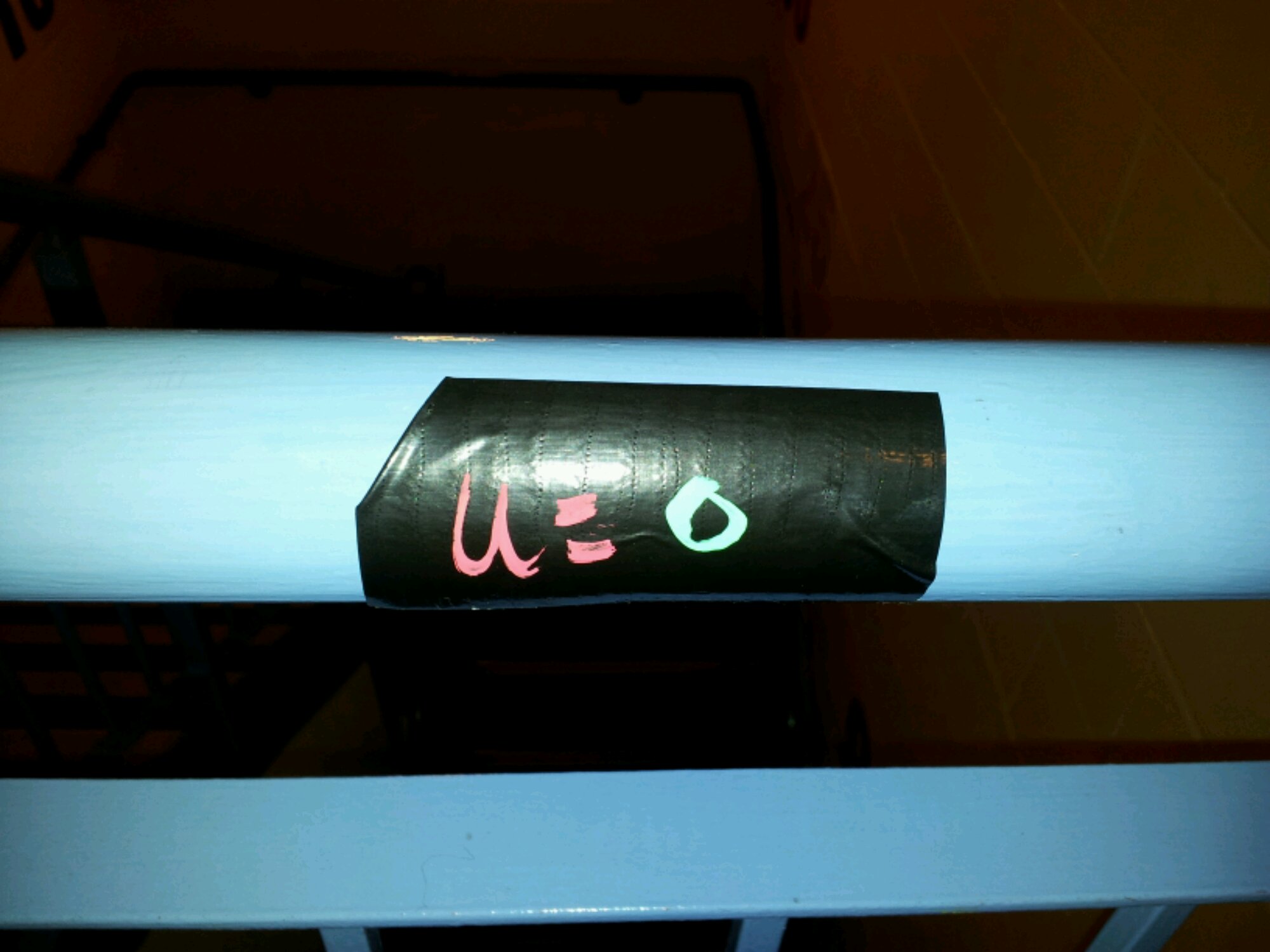
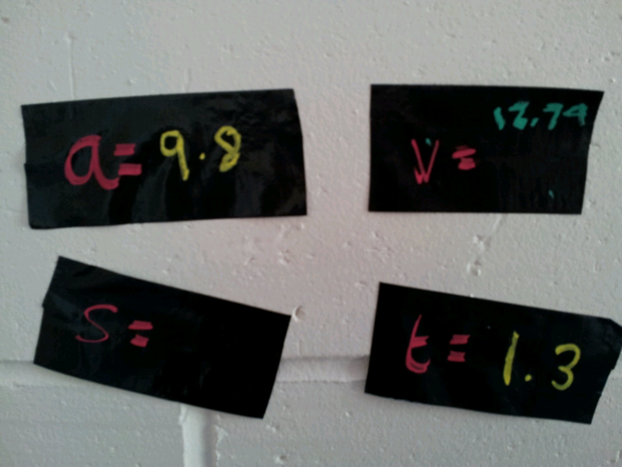
It’s all very well drawing diagrams for A-Level Mechanics questions, but how about a life size diagram? We were looking at vertical motion under freefall/gravity. I gave the students pieces of duct tape chalk labelled with a, s, u, v, t. We went to the staircase and labelled the wall with the tape – so u (initial velocity) was taped to the top of the bannister and v (final velocity) went on the floor at the bottom of the stairs, etc.

image

The students then labelled what they knew: a=g, u=0, v=?, t=?, s=?
image

The students used mobile phones to time the drop from the bannister to the floor and calculated the distance and final velocity. The physical activity allowed us to think about how to draw these kinds of diagram.

And finally …
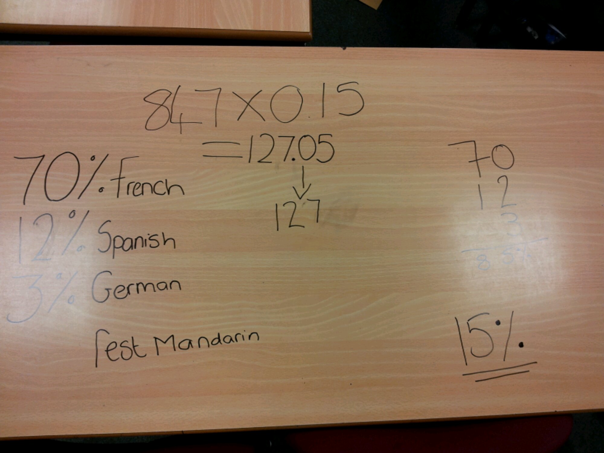
Just some pictures of an alternative whiteboard:

image

image