Category Archives: Handling Data

253. Picture of the week

Here is a quick photo prompt starter for you:
What does this picture make you think of?
image

If you said favourite colour bar-chart or line graph, you’d be wrong.

The shorter the bar, the more popular the colour.

However turn it upside down and here is your line graph:

image

The heights of the blue bars are the amount of each colour used – hence more popular.

247. The Elf Challenge

It was the month before Christmas and all through the house not a creature was stirring – except for the senior elves who were on the brink of all out war. Father Christmas had picked up some leadership strategies on his travels and decided to send his management elves on a team building day … paintballing!

Don’t be fooled – this is no simple Christmas time-filler. This task requires problem solving strategies, two-way tables, averages, data analysis and logic. In fact, you might want to have a go yourself. There is a task sheet, support sheet and solution.

The Elf Challenge (pdf)

Enjoy the puzzled faces and watch the arguments when students try to justify their answers.

243. Messy Means

I have recently been teaching lower ability Year 9 students how to calculate the mean from grouped and ungrouped data tables. I didn’t want to teach them a method to learn by rote, so I used a more investigative approach.

mr-messy-mykea

Image Credit: http://www.thisismykea.com/designs/mr-messy

Grouped Frequency tables discussion

Estimated messy mean A (pdf)

I started with a table with all the working shown, but some information blacked out. Each group had an A3 version and they filled in what was missing.

Estimated messy mean B (pdf)

The second table had more information covered up. After a discussion the groups decided there wasn’t enough information and they would have to guess what the missing numbers were.

Estimated messy mean C (pdf)

The third table had minimal information. Each group used their own method to find the missing values. Some chose the largest value in the range, some guessed what the results could have been in each group and one group decided to calculate two means – one using the largest value and one using the smallest.

We collected our results together on the board and discussed their accuracy. The class decided to use the middle of each range to calculate the estimated mean. They had gone from no understanding of estimated mean to formulating their own method.

We followed this up a Splitting the Steps estimated mean worksheet that I wrote after seeing Bruno Reddy’s presentation after #MathsConf2014 (Mr Reddy’s blog).

Follow him on Twitter: @MrReddyMaths


241. Histogram Hysteria

Are you fed up of explaining the difference between a histogram and a bar graph/chart?

Cheer up! Help is at hand…

I teach a class of bright students with very little self-belief in their abilities and total fear of leaving their comfort zone. Instead of telling them what to do and set page X of textbook Y, I let them tell me what was going on and let them take small steps. After all, you wouldn’t take a beginner climber up the North face of the Eiger, would you?

Let us begin:

Download this simple comparison file: What is a Histogram? (pdf)

First I gave the students individual time to write down what they observed. They then compared their answers in pairs/threes. Finally, I collected their observations together on the board (where I had projected up the comparison worksheet).

This hands on approach allowed the students to understand how a histogram is constructed. There were fewer students thinking that histograms are just bar-charts where the bars touch.

Download the step by step worksheet: Histogram calculations step by step

(Alternatively you can download the worksheet with RAG123 self-assessment at the end: Histogram calculations step by step RAG123 )

This worksheet allows students to get the feel for calculating frequency densities without stress. The instructions are gradually removed, until students are just working from a data source. Then students practise drawing histograms.

It is also a handy revision resource – my students referred back to this worksheet when they were stuck in subsequent lessons, rather than ask me!

233. Summary Statistics

If you are reading this blog there is a high probability that you are a maths teacher – it is a maths education blog after all. That means data shouldn’t be scary … should it?

scary data

Image credit: http://mrcbaker.blogspot.co.uk/2013/08/data-doesnt-have-to-be-scary-how-you.html (This website is worth a look!)

In a world of performance tracking and data analysis, seeing the trends in class data should be easy. However busy lives and hectic timetables mean we often don’t get the time to step back and reflect on our classes.

I decided to pull together the summary data for each of my classes onto one page. I can see a profile of current and target grades (FFTD*), gender, SEN and Ever6** information in one table. The actual act of completing the table made me take a closer look at the abilities and issues within the class. I realise not everyone uses these data measures so the files are in .doc and .docx form. Since the data is summarised it remains relatively anonymous, making it a good discussion document for trainee teachers or CPD.

You can download a customisable form here:
Summary Data for class KS3 (doc)
Summary Data for class KS3 (docx)
Summary Data for class KS4 (doc)
Summary Data for class KS4 (docx)
Summary Data for class KS4 sample (doc)
Summary Data for class KS4 sample (docx)

*FFTD means Fischer Family Trust Data

**Ever6 is a UK measure related to eligibility for Pupil Premium funding (simplified description).

229. Speed Camera Maths

Speed Cameras are so last century: discerning law enforcement agencies favour the Average Speed Camera!

image

These motorway delights timestamp when you go through certain checkpoints and calculate your speed between them. No complicated laser guns required, just number plate recognition and a little distance/time calculation. This already sounds like a KS3/4 class activity or a Mechanics A-Level starter.

Equipment
Squared paper
Pencil
Ruler
Coloured pens
Calculator (optional)

Question
Can you find three different (safe) strategies for staying on the right side of the law through extended roadworks? You must average 40mph over 12 miles (original speed limit 60mph).

Visual Prompt
To start off with just draw out blank axes and discuss how you could visually represent this problem.

Idea 1
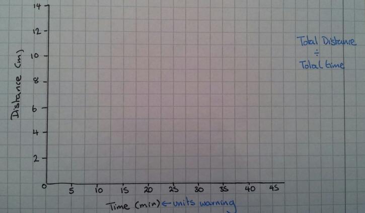
A distance-time graph

image

Idea 2
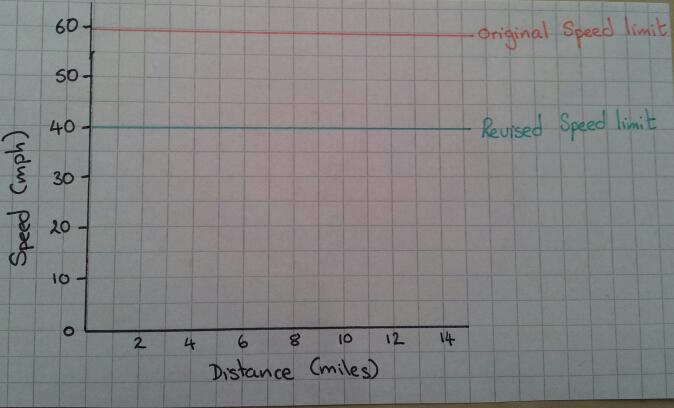
A speed-distance graph

image

Idea 3
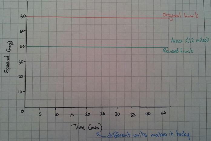
A speed-time graph

image

The straightforward option
How long should it take you to get through the roadworks if you stick to exactly 40mph? What does this look like on a graph? Which type of graph shows this information best?

Top Gear Alert
The boy racer wants to go fast, but avoid a ticket – what could he do?

Hint
What does ‘Average Speed’ actually mean?
Can you instantly jump between speeds?
Is acceleration going to effect your calculations?
What assumptions should you make about acceleration?
Do you need to work out the area under the graph or the gradient at all? How will you do this?
Can you describe what is going on?
Is it safe/legal?

Outcome
Your students should be able to produce many different graphs of how to stay on the right side of an average speed zone. They should be able discuss their findings with each other. However the morality or safety of their driving ideas may be a topic of discussion for a later PSE lesson …

225. Surveying the Monkeys

Designing good survey questions is an excellent way to discuss bias and structure, however carrying out the survey is always the tricky bit.

  • Do you ask the class next door? Always seems more of a social exercise than work
  • Do you set it as homework? Bit hit and miss: mum, dad, nan, dog & a couple of fictional people
  • Do you survey your form? Will they take it seriously?

No matter how you do it, the results are always sparse and barely useable for a data processing task. How can you get a reasonable data set, generated by pupils, for pupils to use?

I’ve mentioned SurveyMonkey in a previous blog post. It is an online data collection tool with free and subscription services.  I asked my Year 9 pupils to write five themed questions, which I then typed into SurveyMonkey. Each set of questions was on a separate page.

image


I then used our home/school communication system to email a link to the survey to every pupil in their year group, with a covering email. You could distribute the link by asking your fellow maths teachers to tell their classes.

I set the first page of the survey as a list of maths teachers. When my class did the survey they were taken to a class list which they ticked off their name and then did the survey. All other classes were taken straight to the survey. In this way the survey results are anonymous, but I know whether my class have completed it (this was their homework). After two weeks we had 100 completed surveys, out of about 200 pupils. This is an amazing completion rate!

While the data was being collected we looked at data processing skills that would be necessary to collate and process the results. The image below is a sample of the collected data printed from Excel.


image

After the results were in I printed out a copy of each set of questions and an Excel spreadsheet of their survey results for each group. The themes chosen were: Movies, Music, Shopping, Animals & Sport.

image

It’s now time for my class to report back on their theme, after dealing with a large data set with anomalies and relate it to their year group. When they have finished I will add a picture of their wall displays. I’m looking forward to seeing how they develop their ideas.